Tuesday, March 27, 2012

Everyday Design Inspiration Blog

Everyday Designs

I have 5 examples that each have their own picture and I will explain the specified criteria that's on the criteria sheet.

The first label I thought looked neat and you do see quite a bit when buying alcohol is McCormick Gin. The target audience is obviously anyone is 21 or older. I feel like the color is good for this clear bottle because the yellow makes the silver typography stand out and the blue at the very top stands out using a reverse technique. The call to action is that the product is obviously going to be bought by someone who wants to drink some alcohol. The production process is done in a specific factory I am sure and that's how these bottles are made. I thought the logo looked really neat and I wanted to share it for this blog. Some of the font is a little tiny at the bottom, but other than that the label looks really good.


The next product that I chose to take a picture of that has a cool design is this pure protein jug. This products target audience is to males probably 16 or older who want to build muscles while lifting weights so they can look fit. The call to action is that it says, "Eat Good, Look Great." It is saying if you use this product you will look good in the end because it has 100% Protein. The production process is from a factory as well because they have to design the label then print an adhesive label then put it on this jug. The color goes with the product because the chocolate flavor being advertised is obviously brown. The typography definitely stands out great because of the different types of fonts they used and the facts it has on the front of it. The logo design looks great overall to me because of what I just said as well.


Another item I took a picture of was my friends canteen that she got from Las Vegas on her Spring break. The target audience I say would be to visitors of 21 or older of age that visited Las Vegas and call to action is basically just inspiring customers to buy this so they can have a momentum of Las Vegas. I would say the typography and logo are very hard to read because you can barely read Las Vegas underneath the blue glitter all over the canteen. The color to me sort of goes with the product, but like I said before it is very hard to read. The production process for this canteen was done probably from a special company that the city of Las Vegas goes through to get specific products made for tourists to remember the town they visited.


I found this billboard on my way back to Pittsburg, KS. I thought at first it looked interesting which it does, but the thing that bothers me the most about it is how the main part of it is not straight, its not flatly pressed on there. It's all wrinkly which really bugs me. The target audience could be anyone because it has something that would interest anyone. The call to action is,"The Auto Show, Cruise-In, and Concert." The typography and the logo design to me seems like it is pushed together and I think it could even be put on a bigger billboard then this one specifically. The typography at the bottom I feel could be a little bigger and the fonts seem like there is too many different fonts going on as well. The production process obviously put together by the town of Pittsburg and is sponsored by all the businesses listed all around the border of the billboard.


The last image I decided to take a picture of was Mr. Goodcents Subs & Pastas magnets. The call to action on this magnets is we deliver. They list their number brightly with the red typography to grab the viewers attention. The target audience is anyone who loves to eat fast food and anyone in general really. The logo design is in a good spot I think and it definitely grabs the viewers attention. I like the fact the call to action is white, the number is red, and the store and its information is in black because it looks more professional. The production process was to go through a print shop and print a bunch of Mr. Goodcents magnets to hand out to the community to gain business from potentially new and old customers. All the information I wrote on here was from what I learned over the years in graphic design and digital file prep because the books explained most of the designed process and each professor explain it well too.


Monday, March 26, 2012

Magazine Ad and Billboard Thumbs and Roughs Blog

Magazine Ad Thumbs and Roughs Project

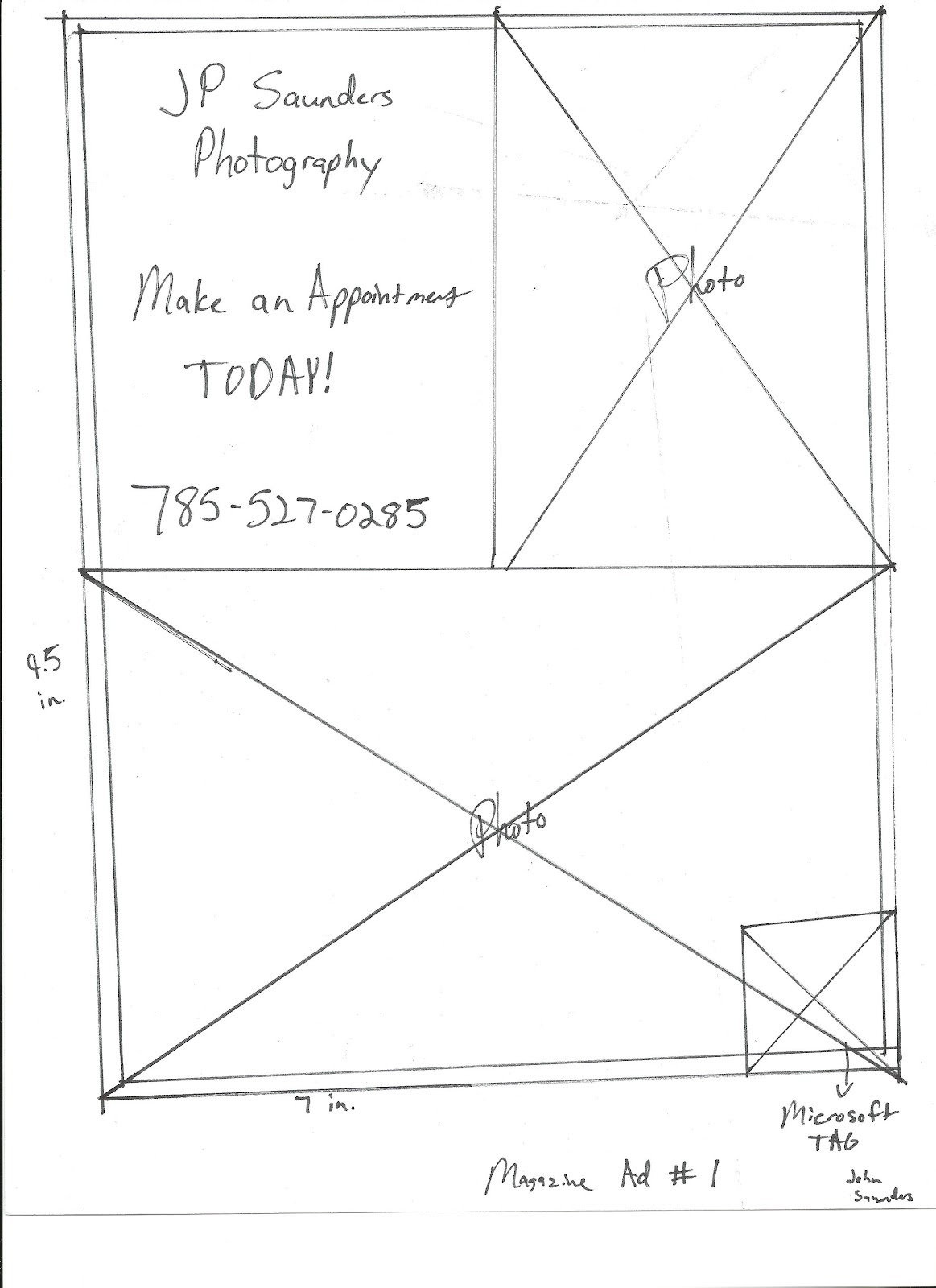
I chose to put an ad if I could would be to put an ad of my photography business in Peoples Magazine. The file format will be done in Adobe InDesign. My design has live area within all the pictures that are on it. All the pictures that are going to be on this project will be my own that I have taken. I am thinking I will do this magazine in black and white so it will save me money in the long run, which would cost me $214,100 which I am pretty sure there is no budget. The cost for color if i decided to do it in color would be $305,900 for a full-page ad. The purpose of the ad is gain viewers attention about booking a session with me and learning about my business. Call to action is getting people interested in sessions and they will find out more scanning the Microsoft Tag that I have placed on the ad. The live area in the ad itself is 7 inches wide by 10 inches high. The bleed size would be 8 1/8 inches by 10 3/4 inches. The trim size would be 7 7/8 inches by 10.5 inches. The  From the Master image list I plan to use screen tint, reverse, and gray scale images.
Thumbs


Magazine Ad Roughs 1 & 2


Here is the final project image. From the Master Image Checklist I used a screen tint, a reverse, and a 4 color raster for my images that are copyrighted under me.


Billboard Thumbs and Roughs Project

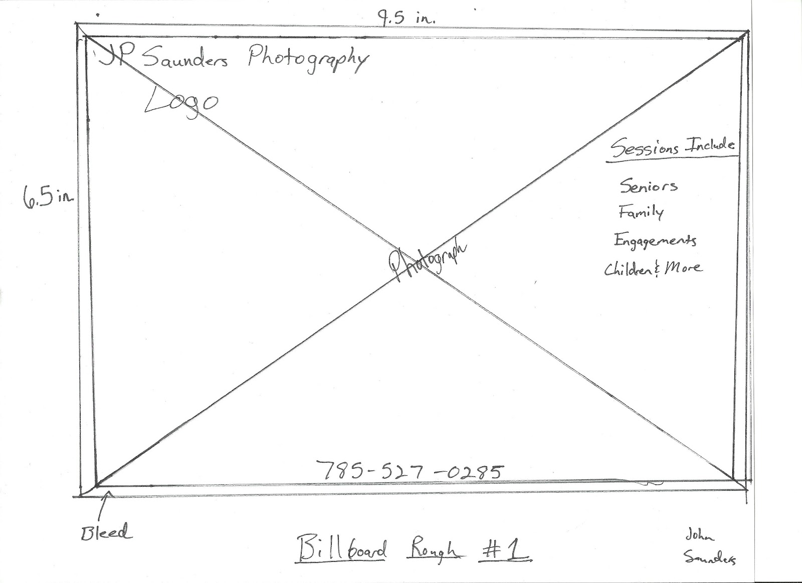
The billboard project is way different than others because for one you have to try to catch someones attention from a far away view because a billboard is 10 feet 5 inches by 22 feet 8 inches. It's huge basically and that's a big part of it why it's so different and you need to use as few words possible so it will be easy to read when driving by it on the highway. You do need to focus on your images resolution when doing this project because you want to make sure your image is crisp and sharp looking so it doesn't look awful like since I am doing my project over my photography business than I need to make sure my images look sharp and clean. The pixels when building a billboard need to be at 72 ppi.

The purpose of the billboard is gain viewers attention about booking a session with me and learning about my business. My call to action is making people become familiar with my business by seeing it on a billboard so they know it actually is a business. My target audience is parents and couples because they are the main people who always book sessions, whether its seniors, engagements, etc. My plan is to use a 4 color raster from the master image checklist when doing this project so the billboard stands out. The size of the document in InDesign will be 19.5 inches wide  by 15.5 inches high. The actual size of the billboard would be 10 feet 5 inches by 22 feet 8 inches and the trim size is 10 feet 6.5 inches by 22 ft 9.5 inches. The bleed will be .125 inches in the InDesign layout. and margins will be .25 inches. The file type will be a Photoshop document and turn into a JPG when finished. I forgot to mention the price to produce a billboard of 10 feet 5 inches by 22 feet 8 inches is about $700.

Thumbs


Billboard Roughs 1 & 2


Billboard Final Image. I didn't use anything from my Master Image Checklist for the Billboard Project. The image is copyrighted underneath me.


Tuesday, March 13, 2012

Job Search Analysis 1

The job I found was being an information technology digital photographer full-time at Northrop Grumman in Topeka, KS. It is a type of corporation. Basically the point of the job is they tell someone what they need to take pictures of then they take them then work at a desk trying to perfect them on Photoshop. I meet the qualifications of having some college experience in my field, because I got it from Pittsburg State University. It says the individual needs to know how to use Photoshop, which again I know to use that because I use it literally almost everyday. The basic qualifications said I need to pass a background and drug test. I have no worries anything will show up because I have nothing on my record and I have never done drugs. The site says, "The work schedule could be flexible to adapt to the person's class schedule. Work would be performed between the hours of 7:45 a.m. to 4:15 p.m. No weekend or nights are anticipated. This job is located in Topeka, KS so if I was happened to get this job that I did actually apply for I would initially plan to move there so I could work there starting hopefully this coming summer. The job does not list its salary range, but does say its negotiable. I found this posting on Glassdoor.com website and the site where the job is posted is on this link.


Saturday, March 10, 2012

Adobe Software Tutorial Blog 15

Adding a Vignette to a Photograph


When adding a vignette to a photo, the first task you do is create a new layer. Then after that you click the gradient tool on the left side of the screen. Make sure you have black as the fill color or this will not work. You also need to make sure above at the top of the screen after you click the gradient tool that you click the arrow pointing down that gives you more options on gradients and you click the second one. After that you click and drag from each side of the picture to how far you would like the gradient to be on your picture. Then you can fade the gradient or vignette by just bringing down the opacity to whatever you want. The tutorial suggest you bring it to at least no lower than 30%. After this you can flatten the image and save it. After that you have just produced vignette photo. Examples of my pictures shown below. I got this tutorial off of YouTube.

Original Image


Final Image after applying a Vignette


Wednesday, February 29, 2012

Adobe Creative Suite Tutorial Blog 14

The tutorial I chose to do is how to watermark your own photos. The first step to do is open up a picture in Photoshop. Then what you do is go the text tool and you click the picture. When the cursor shows up on the picture you can then pick the font you would like to use and type the name of your business on it to make sure the viewer knows its yours. After you type what you want and adjust it to wear you want, you then go to the opacity and bring the color of the text down by dragging the opacity bar down on the right side, so it will turn out to be a watermark. Don't forget before saving to go to Layer > Flatten Image so you know that it will have the watermark on it and now look different than what you expected. Examples of mine shown below. I learned how to do this on a Photoshop Tutorial website.


Original Image

Image with Watermark


Newspaper Ad Project

The budget for the newspaper ad project is $97. It can't cost anymore than that. The formula to calculate an ad is column width multiplied by height of ad equals answer then multiplyon it again by $4 and you get your total cost. For my project I chose 3 columns wide by 8 inches high, which equals 24 and multiply that by $4 its $96. It means I am one dollar under my limit, which is great news. My target audience for my pretend bakery business is families or the community in general because they might be interested in having cakes done for their kids or anyone in their family really. My call to action is for my Grand Opening give them a free cupcake just for checking out the new place. The purpose is to convince people to checkout a new place in town.

A bitmap image only contains black and white pixels with no shades of gray and they also need to be at a high resolution. You get a bitmap image by creating it by hand then scanning it in with a scanner. An example of this would be like if someone wrote their name in marker than uploaded it or created an image with a marker and uploading it would work too. Below are my thumbs and roughs for my project. When the image is scanned in for a bitmap it needs to be 1200 ppi.


On the Master Image Checklist I used a bitmap image and I also used a vector image that I created in Adobe Illustrator. It cost me 5 cents to print at Quick Print, but if it were for an actual price in the Collegio, it would be $96 to have it printed in the newspaper.

The Final Finished Image


Tuesday, February 28, 2012

Master Image List Blog

A bitmap image only contains black and white pixels with no shades of gray and they also need to be at a high resolution. You get a bitmap image buy creating it by hand then scanning it in with a scanner. An example of this would be like if someone wrote their name in marker than uploaded it or created an image with a marker and uploading it would work too. Here's an example shown below.


Reverse is relatively easy to explain. Reverse is basically when you switch black and white colors on a page. An example is like you type a white font on a black background. This can be done in Photoshop, InDesign, and Illustrator.


Vector art is a pixel free graphic. It generates smooth lines when it's brought it because of like I said before it don't contain pixels. They are also not subjected to scaling restrictions. Not every vector format is the same though, which means they all can't be printed. This can be saved as an EPS or AI file. I didn't have anything to upload for this example.

Grayscale raster is basically a black and white image and is used many times in newspaper advertisements. This is done in Photoshop then you save it as an EPS file then bring it into InDesign. Example of a grayscale raster is below of my friend, who I took a picture of last semester.


Duotone raster is when an image is made up of two colors and one of the colors is usually black while the other is a spot color. It is a great way to add a visual interest to a job. This can be done in Photoshop and is usually saved as an EPS file. Example below is a duotone of a light blue and black. The reason its framed is because I had to move it into InDesign so I could put it on my blog.

A silhouette raster is when you erase the background behind your image usually by creating a mask or path that allows the subject to display without a background. It is also called a dropout. This can be done in Photoshop. It can also be created by the print service provider.

A full bleed raster is when an image covers the whole picture box in InDesign and goes to the bleed marks on the outsides, which is 0.125. It hits every side of the square to make sure the picture is in proportion and helps to make sure you know what will be cut off when it is printed. It's hard to show a picture of this one.

A four color raster is when an image or document uses only four colors in the project, which is CMYK (Cyan, Magenta, Yellow, and Black.) Most files that are printed are in CMYK just a quick note to this as well. This one is basically all ready set up for you in an InDesign document so its not too complicated to figure out.

Screen tint is when you want to fade or give your object more shade in a document to make it have a neat feature to your project. I used the book, Print Production with Adobe Creative Suite Applications by Claudi McCue to answer these questions for this blog. All images were taken or created by me.